Make Your Home Smarter, One Step at a Time

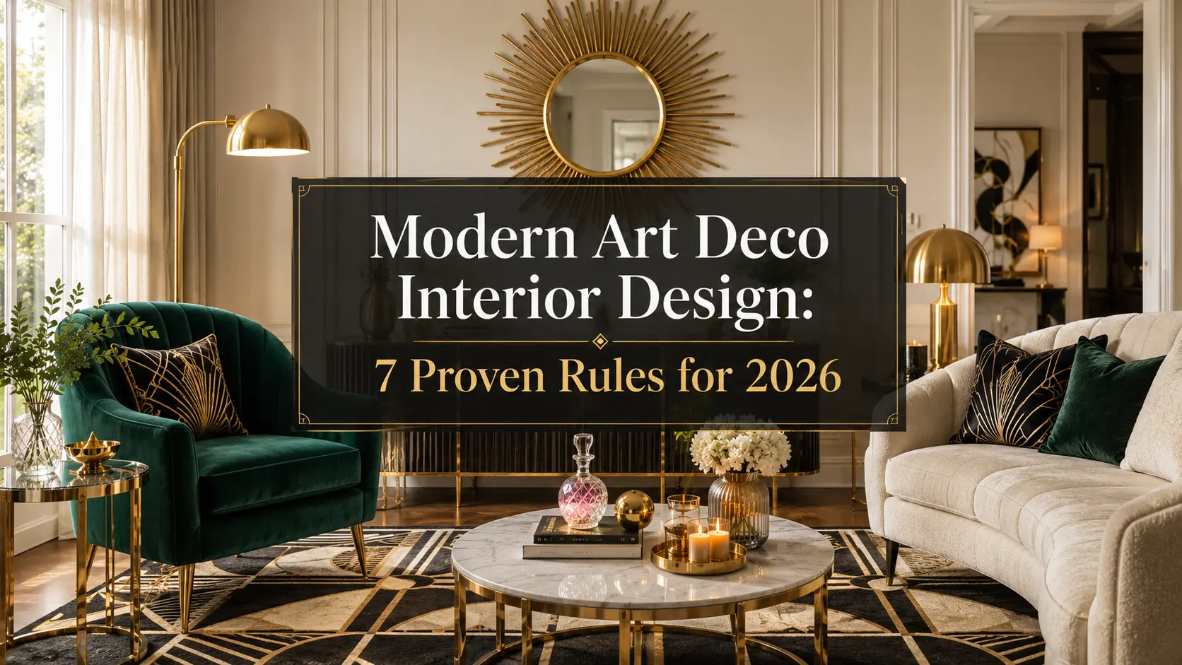
Table of Contents
I still remember the first time I walked into an old prewar apartment lobby and stopped dead in my tracks. Sunburst mirrors. Fluted columns. A geometric floor pattern that looked like it belonged in a jazz-age fever dream. That’s Art Deco doing what Art Deco does best — making an entrance. And lately, I keep seeing that same energy show up in living rooms, home bars, and bedroom headboards all over my Pinterest feed. Turns out I’m not imagining it. Modern art deco interior design is having a real moment, and if you’ve been wondering whether it’s worth chasing or just another passing trend, you’re in the right place.
Here’s the thing about Art Deco: it’s never fully gone away. It just cycles back in, usually when people get tired of beige-on-beige minimalism and start craving a little drama again. And 2026 is shaping up to be one of those years.
Key Takeaways
- Modern art deco blends the glam geometry of the 1920s-30s with today’s cleaner, more livable proportions
- It’s built on bold geometric patterns, rich jewel tones, metallic accents, and lacquered or high-shine finishes
- There’s an easy styling formula (the 3-5-7 rule) that makes shelves and vignettes look intentional instead of cluttered
- Art Deco is genuinely trending back into style for 2026, alongside a broader return to maximalism and “grandmillennial” glam
- You don’t need a full gut renovation — a few well-chosen pieces can shift a whole room’s personality
How We Put This Guide Together
Quick note before we dive in, because I think it matters: this isn’t a listicle assembled from other listicles. Everything here comes from a mix of firsthand styling experience, cross-referencing real search behavior (the actual questions people type into Google when they’re stuck on this exact topic), and design history research to make sure the “why” behind each trend actually holds up. Where I recommend a product later in this guide, it’s because it fits the specific look we’re talking about and has a solid track record of reviews — not because it showed up first in a random search. I’d rather send you to three things that actually work than thirty that just fill space.
Settings saved.
What Is Modern Art Deco Interior Design, Exactly?
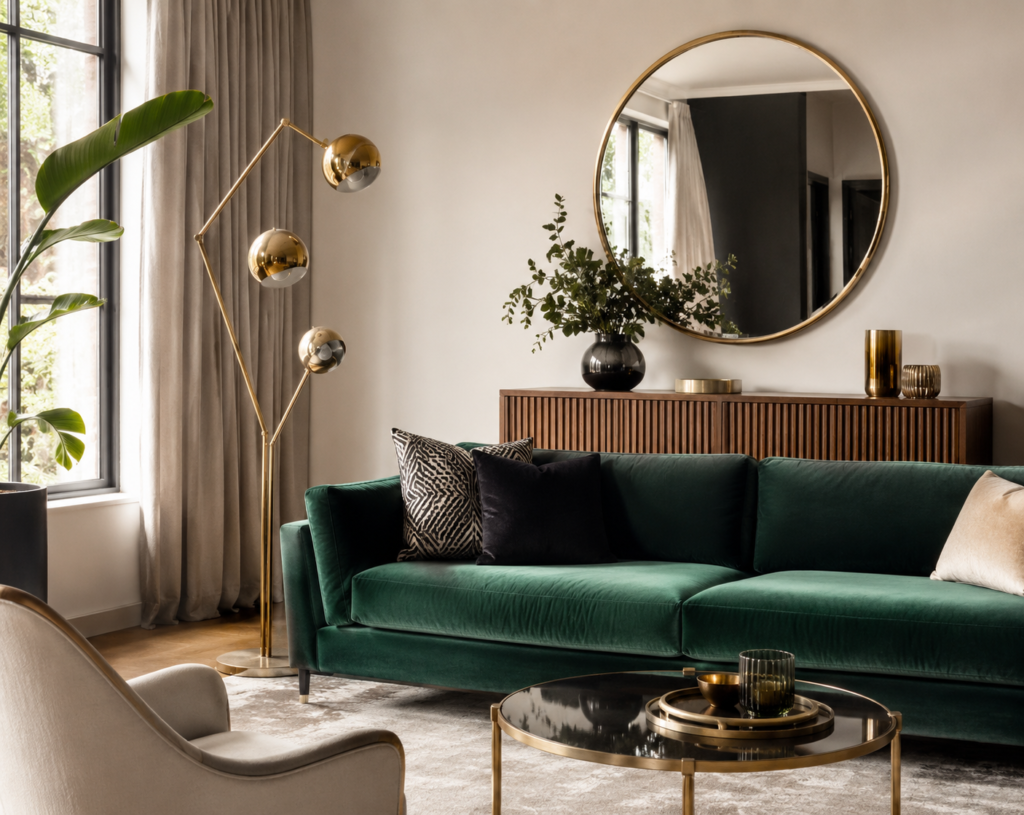
Let’s clear this up first, because “modern art deco” sounds like a contradiction. Isn’t Art Deco the opposite of modern? Not quite. Art Deco was actually born as a modernist movement itself — it emerged in the 1920s as a reaction against the fussy, overly ornamental Art Nouveau style that came before it. It was sleek and geometric for its time. What we now call “modern art deco” simply takes that original DNA — the symmetry, the glamour, the confidence — and updates it with cleaner lines and more livable, less museum-piece proportions.
In practice, that usually breaks down into three recognizable flavors:
- Classic/Traditional Art Deco — think Great Gatsby-era opulence, ornate detailing, exotic wood veneers
- Streamline Moderne — the sleeker, more aerodynamic cousin, inspired by ocean liners and early automobiles, with curved edges and less ornamentation
- Modern/Contemporary Art Deco — today’s interpretation, which pares back the fussier details and leans into bold pattern and color while keeping furniture simple and functional
If you’re decorating a real home (not a movie set), you’re almost certainly working in that third category, and honestly, that’s the fun one.
The Colors and Materials That Define the Look
Art Deco has a color story, and it’s not subtle. Picture emerald green, sapphire blue, deep burgundy, and black, all set against gold, brass, or chrome. Add in a base of cream, ivory, or soft neutrals to keep it from feeling like a casino floor. What I find interesting is how much restraint modern versions actually use — you’ll usually see one or two jewel tones as accent colors, not walls covered in them.
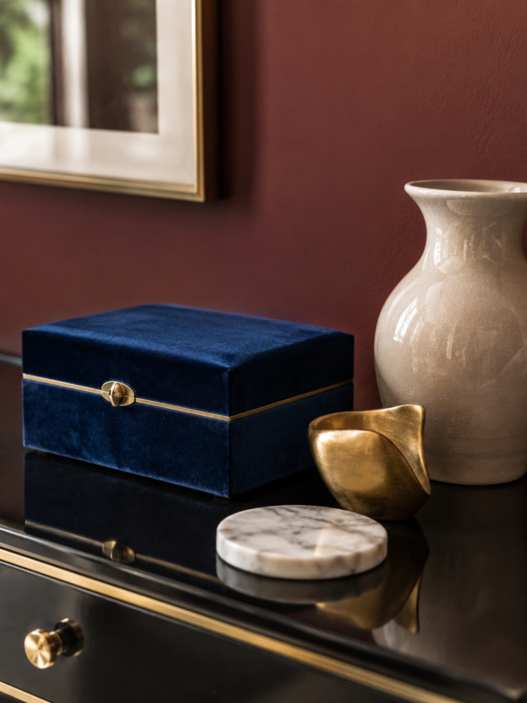
On the materials side, the four features that instantly read as Art Deco are:
- Geometric patterns — think sunbursts, chevrons, stepped ziggurat shapes, and symmetrical repeats
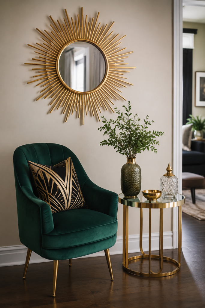
- Metallic accents — brass, gold, and chrome hardware, trim, and light fixtures
- High-shine, lacquered, or mirrored finishes — on furniture, tabletops, and accent walls
- Bold, saturated color paired with rich materials — like velvet upholstery or marble surfaces
Can you mix Art Deco with modern furniture? Absolutely — and honestly, most people already have some of the raw ingredients (a brass lamp here, a velvet throw pillow there) without even realizing they’re halfway to the look already. If you want to see how a lot of that metallic-and-glam lighting language plays out in a full room, our guide to modern lighting ideas for the living room is a good next stop.
Why Did Art Deco Fall Out of Style in the First Place?
If it’s this striking, why did it ever disappear? Simple answer: money and mood. The style peaked before the Great Depression and World War II, and once resources got scarce, that kind of lavish, materials-heavy design started to feel out of touch. Postwar decades leaned into simplicity and mass production instead — think mid-century modern’s clean, affordable lines. Art Deco went from “aspirational glamour” to “relic of a bygone era” almost overnight.
But trends are cyclical, and after years of minimalist, gray-and-white interiors, a lot of people are craving that same richness and personality again. That’s exactly what’s fueling the current comeback.
The Styling Rules That Make Art Deco Actually Work in Your Home
This is where a lot of people get nervous. Bold pattern and metallic finishes can tip into “too much” fast if you don’t have a framework. So let’s talk about the rules that keep it looking curated instead of chaotic — because honestly, this is the part that took me longest to actually understand.
The 3-5-7 Rule
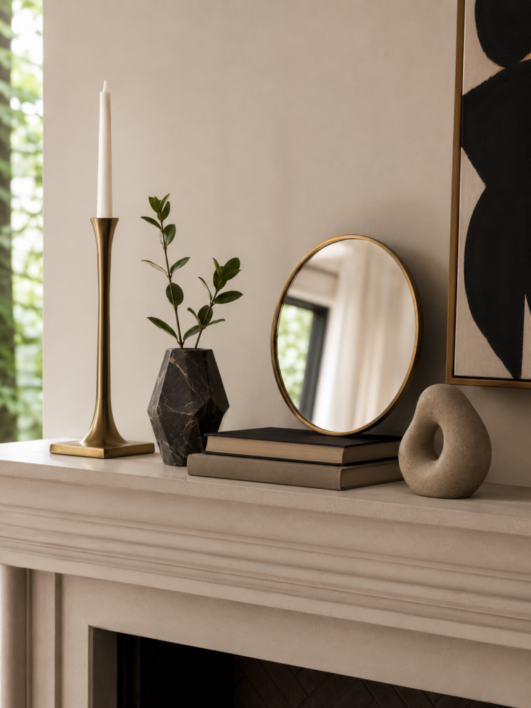
This is a simple styling trick for arranging objects on shelves, mantels, or console tables. Group items in odd numbers — three, five, or seven pieces — because odd numbers naturally read as more visually interesting than even ones (your eye doesn’t want to split things into neat, boring pairs). Vary the heights, mix in one or two Art Deco-style pieces like a geometric vase or a small brass sculpture, and leave breathing room between groupings.
The 60-30-10 Rule for Color
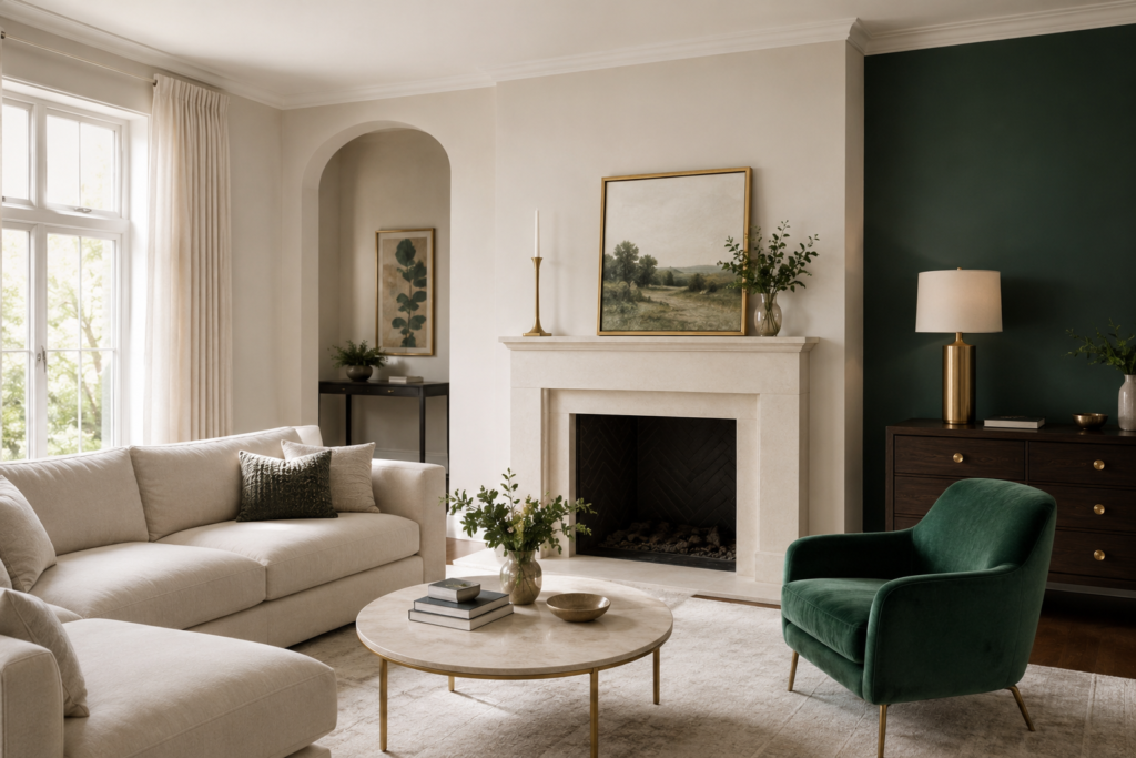
You might be wondering how to actually use those jewel tones without going overboard. This is the answer: 60% of the room in your dominant neutral (walls, large furniture), 30% in a secondary color (your jewel tone — say, emerald upholstery or a navy accent wall), and 10% in an accent color or metallic (gold hardware, a mustard throw pillow). This alone solves most of the “how do I make this look intentional” anxiety.
The 4-Inch Rule
A smaller but genuinely useful one: when hanging art or mirrors above furniture, keep about four inches of space between the top of the furniture and the bottom of the piece. It’s a tiny detail, but it’s the difference between a wall that looks styled and one that looks like things were just placed wherever there was room. If you’re working with a smaller footprint, our small bedroom style ideas guide covers a lot of the same spacing logic in tighter rooms.
Common Mistakes to Avoid
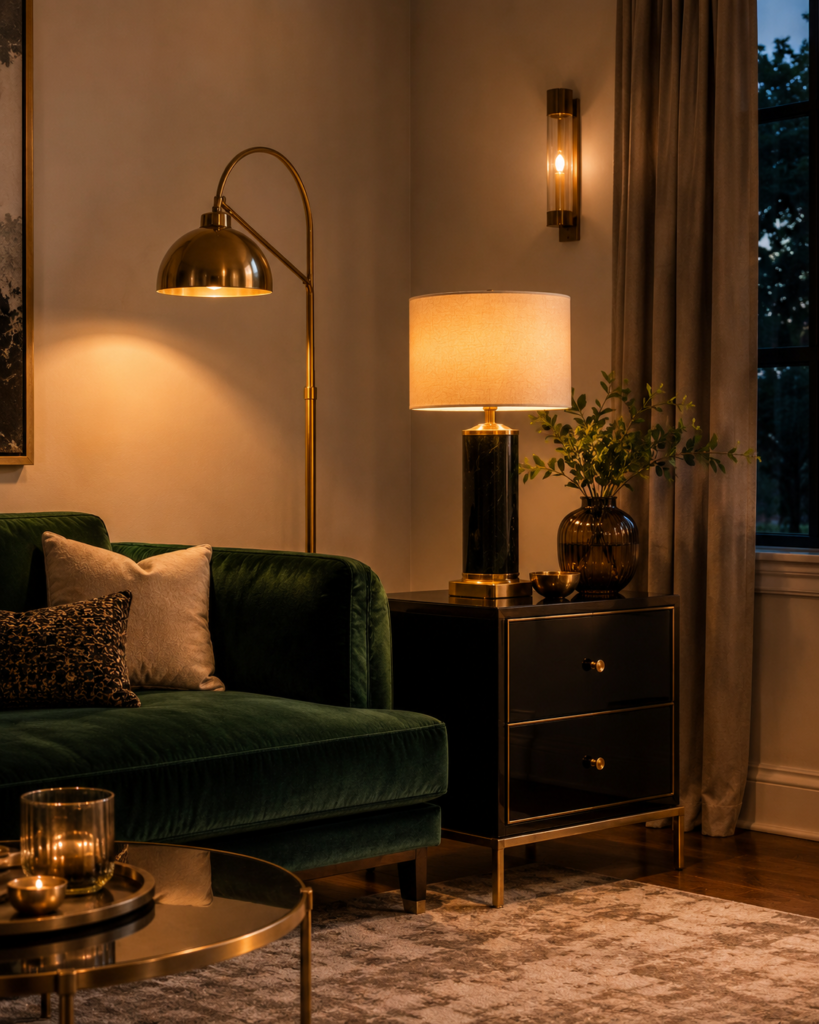
I’ve watched a lot of Art Deco attempts go sideways, and it’s almost always one of these five things:
- Buying a matching furniture set all at once. This is the fastest route to “hotel lobby” instead of “curated collection.” Art Deco rooms should look assembled over time, even if you bought everything last month.
- Using too many metallics that don’t match in tone. Warm brass and cool chrome fighting in the same room reads as accidental, not eclectic. Pick one dominant metal and let the other appear sparingly, if at all.
- Skipping texture. A room can have the right colors and shapes and still fall flat if everything is the same flat, matte surface. Velvet, lacquer, and glass need to coexist.
- Going all-in on pattern with no neutral ground. This is where the 60-30-10 rule saves you — without it, geometric prints stack on top of each other until the room feels dizzying instead of glamorous.
- Ignoring lighting. Art Deco is a style built around shine and shadow. Flat, overhead lighting flattens the whole effect. Layered lighting — a floor lamp, a table lamp, an accent fixture — is what makes the metallics actually glow.
The Art Deco Essentials Checklist
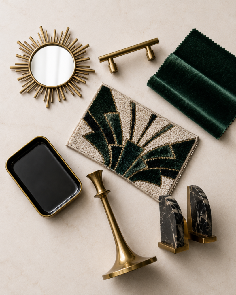
If you’re starting from zero and want a shortlist to work from, here’s what I’d actually prioritize, roughly in order of impact-per-dollar:
- ☐ One statement lighting piece (sunburst mirror, sculptural table lamp, or a fluted floor lamp)
- ☐ A single jewel-tone anchor (an accent chair, a velvet sofa, or a painted wall)
- ☐ Metallic hardware in one consistent finish (drawer pulls, curtain rods, picture frames)
- ☐ At least one geometric textile (a patterned rug, throw pillows, or drapery)
- ☐ A high-shine or lacquered surface somewhere in the room (a side table, a tray, a console)
- ☐ A grounding neutral base (walls, large upholstery, or flooring) so the bold pieces have room to stand out
- ☐ Symmetry in at least one vignette — matching lamps, bookends, or wall art placed in pairs
You genuinely don’t need all seven at once. Even hitting three or four of these will shift a room’s whole personality.
Art Deco vs. Other Interior Design Styles: A Quick Comparison
This trips people up constantly, so let’s untangle it with an actual side-by-side. All of these overlap a little, which is exactly why the confusion happens.
| Style | Time Period | Core Feeling | Key Materials | Best For |
|---|---|---|---|---|
| Art Deco | 1920s-1930s | Glamorous, symmetrical, bold | Brass, lacquer, velvet, marble | Living rooms, bars, entryways |
| Modern (Design-History Sense) | Ongoing since mid-1900s | Functional, minimal, restrained | Steel, glass, unadorned wood | Open-concept, low-clutter spaces |
| Mid-Century Modern | 1940s-1960s | Warm, organic, understated | Teak, walnut, tapered wood legs | Living rooms, home offices |
| Art Nouveau | 1890s-1910s | Flowing, botanical, ornamental | Stained glass, wrought iron, curved wood | Statement lighting, entry details |
| Hollywood Regency | 1930s revival, ongoing | Feminine, glossy, dramatic | Lacquer, mirrored glass, chinoiserie | Bedrooms, powder rooms |
And if you’re wondering whether The Great Gatsby is Art Deco or Art Nouveau — it’s firmly Art Deco. Art Nouveau came earlier and is the flowing, botanical, stained-glass style you’d associate with Tiffany lamps, which is really the aesthetic Art Deco was rebelling against.
As for flooring that suits an Art Deco living room: geometric tile patterns, herringbone or chevron hardwood, and high-gloss finishes all fit the bill. If you’re not ready to redo floors, a bold geometric area rug does most of the work for a fraction of the cost.
Is Art Deco Actually Coming Back in 2026?
Short answer: yes, and it’s part of a bigger shift. After a decade of minimalist, “quiet luxury” interiors, design trends are swinging back toward maximalism, bold color, and personality-driven spaces. Mid-century modern is holding steady too, which makes sense — the two styles share enough DNA (geometry, warmth, craftsmanship) that they’re often trending together rather than competing.
What’s going out of style alongside this shift? All-gray everything, cold minimalist spaces with no texture, and furniture that looks like it was designed to disappear rather than make a statement. If your space has felt a little flat lately, that’s not a coincidence — it’s the design zeitgeist catching up with you. If you’re renting or working with a smaller footprint, our college bedroom ideas guide and small room lighting ideas post both cover how to get personality-driven results without a renovation budget.
Fun fact for the curious: New York City is widely considered the spiritual home of Art Deco, thanks to landmarks like the Chrysler Building and Rockefeller Center, so if you ever want a real-life mood board, a walk through Midtown Manhattan will do more than any Pinterest board could.
Shop the Look: Art Deco Pieces Worth Considering
✨ Statement Piece: HEBOIX Gold Sunburst Wall Mirror
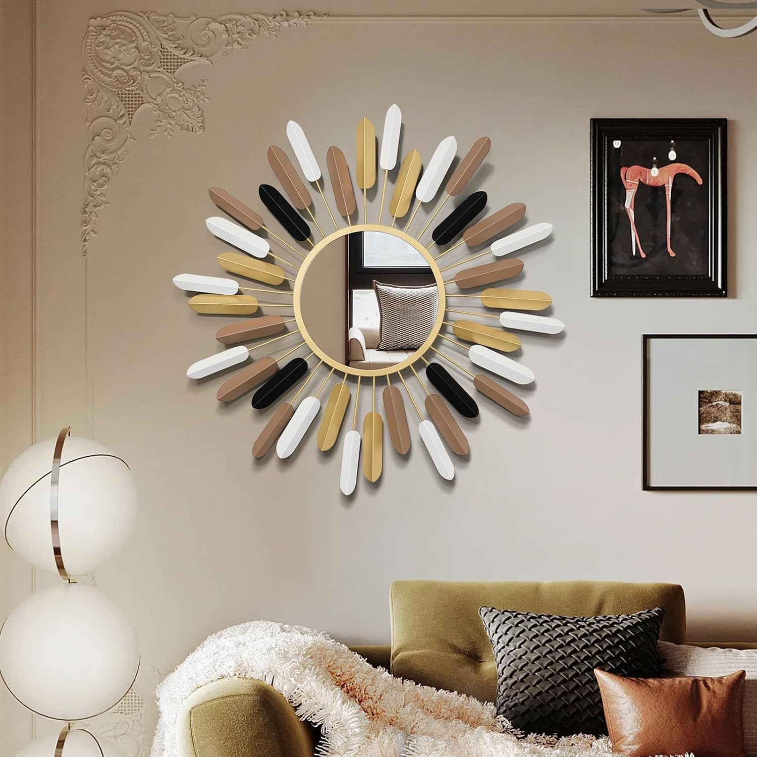
The single best entry point on this list if you’re only adding one Art Deco piece. The fanned metal rays around the round mirror instantly read as glamorous without needing anything else in the room to match. Works equally well over a console table, mantel, or as an entryway focal point.
Available finishes: Brown, Gold, Gold-flower
Pros
- Instant “statement piece” impact with zero styling effort
- Lightweight, straightforward to hang
- Multiple finish options to match warm or cool metallics
Cons
- Metal rays can bend slightly if handled roughly during unboxing
- Not real glass on the budget finish tier — check listing specs
~$86 (varies by color)
🏠 Check Price on Amazon
💺 Jewel-Tone Anchor: LIANGFU Modern Velvet Upholstered Accent Chair

This is your jewel-tone anchor without committing to a full sofa reupholster. The armless, tufted-back silhouette keeps it from feeling bulky, and the velvet finish gives you that soft, light-catching texture Art Deco rooms rely on.
Available colors: 🟢 Green, ⚫ Black, ⚪ Cream/Ivory, 🩶 Gray, 🔵 Blue
Pros
- Compact armless frame fits smaller rooms and corners easily
- Genuinely plush velvet feel praised by owners
- Wide color range makes it easy to match your accent tone
Cons
- Some assembly required on arrival
- Velvet can show pressure marks/shading until settled in
$139.99–$169.99
🏠 Check Price on Amazon
🛋️ Lounge-and-Cocktails Pick: Velvet Wingback Accent Chair with Ottoman

If you want more presence in the room than an armless chair gives you, this wingback-and-ottoman combo brings that lounge-and-cocktails energy the Art Deco look is known for. The high back and rolled arms add a bit of old-Hollywood drama, and the matching ottoman makes it feel like a complete seating moment on its own.
Available colors: ❤️ Burgundy, 💚 Green, 🔵 Blue, ⚫ Black, 🩶 Gray
Pros
- Includes matching ottoman, so it reads as a finished set
- Higher wingback profile adds visual drama and comfort
- Rich jewel-tone colorway options
Cons
- Takes up more floor space than an armless chair
- Heavier and bulkier to move once assembled
~$219.99–$269.99
🏠 Check Price on Amazon
🔩 Cheapest High-Impact Swap: QOGRISUN Gold Geometric Cabinet Knobs (6-Pack)

This covers the “consistent metallic hardware” checklist item for under $20. Swapping dated knobs on an existing dresser or cabinet for these faceted, geometric ones is one of the cheapest ways to shift a whole piece of furniture’s personality without buying anything new.
Available finishes: 🟡 Gold, ⚫ Black, ⚪ White
Pros
- Extremely low cost for a noticeable style upgrade
- Standard screw sizing fits most existing cabinet holes
- Geometric faceted shape reads as Art Deco instantly
Cons
- Only comes in a 6-pack, so measure your needs before ordering
- Finish can wear over years of heavy daily use
~$12.99–$18.99
🏠 Check Price on Amazon
🟦 Room Anchor: RELEANY Washable Geometric Area Rug

This handles the geometric textile checklist item and does a lot of heavy lifting for anchoring an entire room layout at once. The fan/chevron-style motif is genuinely Art Deco rather than a generic geometric print, and being machine-washable makes it far more practical for households with kids or pets.
Available colors: 🤍 Beige/Gold, ⚫ Black/Gold, 🩶 Gray/Gold, 🤎 Brown/Beige, 🟦 Blue/Gold
Pros
- Machine-washable, a rare feature for a patterned area rug
- Fan/chevron motif is authentically Art Deco, not generic
- Wide range of sizes and colorways available
Cons
- Low-pile design, so it feels thinner underfoot than a plush rug
- May need a rug pad to stay fully flat on hard floors
~$39.99–$99.99
🏠 Check Price on Amazon
💡 Layered Lighting Fix: Brightech Leaf LED Pharmacy Floor Lamp

This addresses the “ignoring lighting” mistake head-on. The pharmacy-style adjustable arm and half-round shade give you a genuinely period-accurate silhouette, and the built-in LED means no bulb shopping or replacements down the line. Great placed beside a reading chair or in a dim corner that needs a warm glow rather than harsh overhead light.
Available finishes: 🟡 Antique Brass, ⚫ Black, 🩶 Satin Nickel
Pros
- Authentic pharmacy-lamp silhouette fits the era well
- Built-in dimmable LED, no bulb replacement needed
- Adjustable arm and head for reading or ambient light
Cons
- Base is relatively small — can tip if bumped on soft flooring
- Metal arm can wobble slightly over time with frequent adjusting
~$79.99–$99.99
🏠 Check Price on Amazon
🪞 High-Shine Surface: Deco 79 Mirrored Metal Accent Side Table

This is genuinely one of the easiest single pieces to build a whole vignette around, and it covers the high-shine/lacquered surface checklist item in one shot. The mirrored top and gold metal frame catch light beautifully next to a lamp or a small stack of books, and the brand (Deco 79) is essentially built around this exact aesthetic.
Finish: 🟡 Gold / Mirrored Glass
Pros
- Mirrored top instantly elevates any vignette placed on it
- Sturdy metal frame despite the delicate look
- Purpose-built Art Deco brand aesthetic, not a generic import
Cons
- Mirrored top shows fingerprints and dust more visibly
- Smaller tabletop surface, better for decor than heavy daily use
~$99.99–$139.99
🏠 Check Price on Amazon
🎨 Low-Commitment Color Test: CaliTime Soft Chenille Throw Pillow Covers (Set of 2)

The easiest, lowest-risk way to test a jewel tone before committing to bigger furniture. The chenille texture gives a soft, subtle sheen that plays nicely with velvet and lacquer surfaces elsewhere in the room, and the huge color range means you can match almost any accent scheme from the 60-30-10 rule.
Available colors: 💚 Emerald Green, 🟦 Navy Blue, ❤️ Burgundy, ⚫ Black, 🤍 Cream, 🩶 Gray, 🟨 Mustard Gold, 🩷 Blush Pink, 🤎 Brown, and more
Pros
- Very low cost way to test jewel-tone colors first
- Huge color selection to match any accent scheme
- Soft chenille texture with a subtle, non-shiny sheen
Cons
- Covers only — inserts sold separately
- Chenille can shed slightly when new, per some owners
$14.99–$24.99
🏠 Check Price on Amazon
🖼️ Symmetrical Wall Moment: VIYYIEA Gold Abstract Textured Canvas Wall Art

Pairs beautifully in a matched, symmetrical arrangement — exactly the kind of pairing the checklist calls for. The textured, gold-toned abstract design adds dimension and shine to a wall without needing an ornate frame or busy imagery, keeping it firmly in “modern” Art Deco territory rather than dated or overly literal.
Available colorways: 🟡 Gold & White, ⚫ Black & Gold, 🤍 Beige & Gold
Pros
- Textured canvas adds real dimension, not a flat print
- Works well as a matched pair for symmetrical styling
- Neutral-plus-gold palette fits almost any accent color
Cons
- Sold as a single canvas — buy two separately for a matched pair
- Texture can show dust over time, occasional light cleaning needed
~$49.99–$89.99
🏠 Check Price on Amazon
For more on layering the kind of lighting that actually makes metallics and lacquer surfaces shine (rather than flattening them under one overhead fixture), our bedroom LED wall decor lighting guide and laundry room decorating guide both show how far a little intentional lighting and personality can go, even in rooms you wouldn’t expect.
Frequently Asked Questions
Is Art Deco making a comeback in 2026?
Yes. Design trends are shifting away from minimalist, all-neutral interiors toward bolder color, pattern, and personality, and Art Deco’s geometry and glamour fit that shift naturally.
What are the three types of Art Deco?
Classic/Traditional Art Deco, Streamline Moderne, and Modern/Contemporary Art Deco — the last of which is what most homeowners today are actually referencing.
What colors are typically used in Art Deco design?
Emerald green, sapphire blue, burgundy, and black, paired with gold, brass, or chrome metallics and a cream or ivory base.
Why did Art Deco fall out of style?
The style’s reliance on expensive, luxury materials fell out of step with the economic realities of the Great Depression and postwar era, which favored simpler, mass-produced design instead.
What are the four key features of Art Deco design?
Geometric patterns, metallic accents, high-shine or lacquered finishes, and bold color paired with rich materials like velvet or marble.
Can I mix Art Deco with modern furniture?
Absolutely. Most contemporary “Art Deco” rooms are really a hybrid — clean-lined modern furniture with a handful of Art Deco-inspired accents layered on top.
What city is most associated with Art Deco?
New York City, largely thanks to landmark buildings like the Chrysler Building and Rockefeller Center, which remain some of the best real-world references for the style.
What is the 3-5-7 rule in interior design?
It’s a styling guideline for arranging objects in odd-numbered groupings (three, five, or seven) at varied heights, since odd numbers tend to look more visually balanced than even ones.
What is the difference between Art Deco and Art Nouveau?
Art Nouveau (1890s-1910s) is flowing, botanical, and ornamental, while Art Deco (1920s-1930s) reacted against that with sleek, symmetrical, geometric forms.
Is mid-century modern still in style alongside Art Deco?
Yes — the two styles share enough geometric and material DNA that they’re often trending together right now rather than competing for the same room.
Bringing It All Together
Modern art deco isn’t about recreating a 1920s film set in your living room. It’s about borrowing the confidence of that era — the bold geometry, the rich color, the unapologetic shine — and letting it live comfortably alongside your everyday furniture. Start small if you need to: a brass mirror, a velvet accent chair, one wall in emerald or navy. Use the 3-5-7 rule when you style your shelves, the 60-30-10 rule when you’re nervous about color, and don’t be afraid to mix a little glamour into a room that’s felt a little too safe for a little too long.
Have you started incorporating any Art Deco touches into your space yet, or is this the push you needed to finally try that emerald accent wall? I’d love to hear what you’re working on — drop a comment below, share a photo of your own take on the trend, or keep the momentum going with our living room lighting guide and small space styling guide for the next room on your list. And if you found this useful, browsing a few more guides on the blog is honestly the best way to keep the redecorating momentum going before it fizzles out on a Sunday afternoon.